
I'm Shira.
I love talking to users and solving their hard, weird, and pesky problems. I can do both qualitative and quantitative analysis. I can write. I can use most prototyping tools and make pretty things, but I’m just as interested in the process of writing the brief as executing it.
I have a degree in math, experience in operations and in journalism, and I'm working towards a master's in UX Design.
Also, I'm looking for work in the Baltimore/DC area, or remotely.
Improving Chick-fil-A's App
In January of 2020 my MICA graduate cohort was divided into randomly assigned groups and tasked with researching and prototyping improvements to a food ordering digital experience. Our project brief instructed us to "suggest and develop at least two means to improve the kiosk and/or app's user experience that best serve your target audience’s specific goals." My group chose Chick-fil-A.
In the first week, our instructor asked: what problem are you solving?
The Problem
The truth is that we didn't know.
Personally, my knowledge of the chain was basically limited to their politics (which couldn't be farther from mine). I had never been to Chick-fil-A, had food from there, or used its mobile app.
I quickly discovered that Chick-fil-A has a cult-like following in the south. The weekend before we launched the project, I downloaded the app, placed an order, packed up my newborn baby in the car, and drove to Downtown Baltimore to have my very first Chick-fil-A sandwich (it was pretty good). In one of our first Zoom meetings, the team went through the app and tried to place an order. We could point to a few usability issues right off the bat.
But still, there was no large neon sign that blinked "This is The Problem".
The Problem was that we didn't know what The Problem was. We didn't know how users felt about the app experience, the IRL restaurant experience, or how they compared to each other. We had little understanding of the competitive landscape. We didn't understand every nook and cranny of the app. And we didn't know what we didn't know.
To improve the app profoundly, we needed research.
First, let me introduce you to the "we" I keep referring to:
Our Team

Shira Kamiguera
User Research & Testing
Creating understanding & empathy of user needs


Christine Sheller
Account Management
Translating business goals into actionable insights
Discovery:
"A culture of freakish friendliness"
In the one week discovery phase, we conducted 10 user interviews and put out a qualitative/quantitative survey to which we received over 200 responses. We also did secondary research about Chick-fil-A's mission, culture, the strengths of its brand, and the innovative ways in which they were serving their customers.
The Survey
My goal in composing the survey was to gather information about the context in which people buy food from Chick-fil-A and its competitors. I wrote questions about where, when, why, with whom, and how often. Other questions asked users about their thoughts on specific existing features and potential ones. Open-ended questions inquired about respondents' memorable positive and negative experiences with the brand and its competitors, as well as what's most important to them when they place a food order with an app.
The open-ended questions were optional and the multiple choice questions were mandatory. I wanted to give respondents the option to leave long and meaningful replies, but also let them get done with the survey as quickly as possible if they wished. This approach worked: with 218 total responses we captured meaningful quantitative data, and since each of the open-ended questions received 60 to 80 responses we also got a wealth of personal anecdotes, as well as the thoughts and opinions of users in their own words.
The User Interviews
We based our interview guide on Steve Portigal's book Interviewing Users. We asked about users' satisfaction with the app, where, when, why, and with whom they use it, but also how they felt, for example, when they waited for their food, after they finished eating, and about ordering out in general. Our goal was to identify highs and lows in the experience, empathize with the users, and then extract opportunities from these insights.
What We Learned
The result of our research was a massive amount of data that we spent hours sifting through. Fortunately, clear themes emerged early on:
User Context


The Brand Is Strong
Users mentioned Chick-fil-A's famously chipper employees repeatedly. One New Englander told us he was sure "they fly in employees from out of state to help establish a culture of freakish friendliness."
Accuracy > Speed
When we asked users what is most important to them when placing an order from Chick-fil-A or similar establishments, we heard again and again: "that they get my order right". In the survey, 80% of respondents said that it's very important to them that their order is understood and taken correctly, vs 56% who answered that it's very important to them that the process of ordering is fast. Further, a majority of the negative experiences users recounted involved a mistake in their order.
Forget the "Guilty" in "Guilty Pleasure"
When asked about their feelings before, during, and after ordering fast food, as well as during and after eating it, users said things like "in a hurry", "excited", "happy", "hungry", "sleepy", and "satisfied". Few users reported any negative emotions such as guilt or shame.
Hell is Other People
A small but vocal portion of users said they use the app in order to eliminate the need to talk to other people. Reasons ranged from "debilitating social anxiety" to "not having to explain my complicated, picky orders".
Freebies Forever
Almost every positive experience users mentioned had to do with free stuff, either through the app's rewards program, when something went wrong and Chick-fil-A made up for it, or even completely at random (for example when someone else didn't show up to pick up their fries so the employees just gave it away). These kinds of experiences made a strong positive impression.
The Element of Surprise
Further, we noticed a theme: users love free stuff even more when they're not expecting it.
So What?
So we should strive to surprise and delight the user.
Ideation / Exploration
To start honing in on the parts of the app that we would like to redesign, we did several exercises whose goal was to generate ideas. This included affinity mapping, Crazy 8s, sketching and more sketching.
We kept everything very rough - this was about brainstorming, not finalizing. We didn't get attached to any particular idea.
At the conclusion of this phase we achieved consensus around the need for the following:
-
Simpler menu - rethink its information architecture from the ground up
-
More & better pictures of food
-
Rewards, rewards, rewards!
-
Order tracking needs a lot of work


First Iteration:
The Devil's in the Details
Our goals in this phase were twofold: (1) create and test an improved flow for placing an order, and (2) figure out what information users want after they place the order. For the latter, we asked: how much detail is too much detail?
We assumed that having more information would not only cover all of our bases (because different users care about different pieces of info) but also that it would allow us to implement the conclusion of our discovery phase: infuse the app with delight. The order tracking phase is an unavoidable period of waiting. Could we game-ify it? Could we make it funny? Celebratory? In other words, delightful?
To get an answer and test our assumptions, we created two different user flows for order tracking: one with lots of details, and another with hardly any. Bailey whipped up two lo-fi prototypes (using Sketch and InVision) to test out the two concepts, and I wrote the script for user tests, of which we conducted three, using friends and family.
We intentionally worked fast and dirty. Aware that we had some powerful assumptions going in, we didn't want to get invested in any particular idea before putting it in front of users.
Below are the screens of the ordering workflow:
Ordering Workflow
 |  |  |
|---|---|---|
 |
Once the order was placed, we presented users with the two approaches for order tracking. Below are the screens from the two prototypes:
Concept 1: Detailed Order Tracking
 |  |  |
|---|---|---|
 |
Concept 2: Basic Order Tracking
 |
|---|
 |
User Testing, Round 1: Goodbye, Pre-selected Pickle?
We ran three user tests, two in person and one over Zoom, asking the users to perform the same task in each of the prototypes.
What we heard from users:
-
"I like to see what's going on, where is my order in the process."
-
"Why is the pickle already selected?"
-
"Don't tell me to get excited."
-
"I like the classics."
-
"I’m a software developer so I know how it works."
-
"Where's the ETA? I was really fixated on that bar on the bottom."
-
"But where do I park when I get there?"
-
“I eagerly await the fun animation.”
-
“So... should we order Chick-fil-A now?”
Actionable insights for the next iteration:
-
Yes to details but not all details are created equal -
-
Information hierarchy is more important than details; the ETA should be more prominent.
-
-
Users want instructions when they choose a novel pickup method (such as curbside pickup).
-
Users want more customization and more rewards.
Second Iteration:
Hits & Misses
Coming into this phase armed with actionable insights from user testing, we knew what changes to the prototype we needed to make. In addition to improving the information hierarchy, adding customization options, pickup instructions, and rewards, this time we wanted to create a high fidelity prototype that simulates the full Chick-fil-A ordering experience.
The GIFs below show the entire prototype:
-
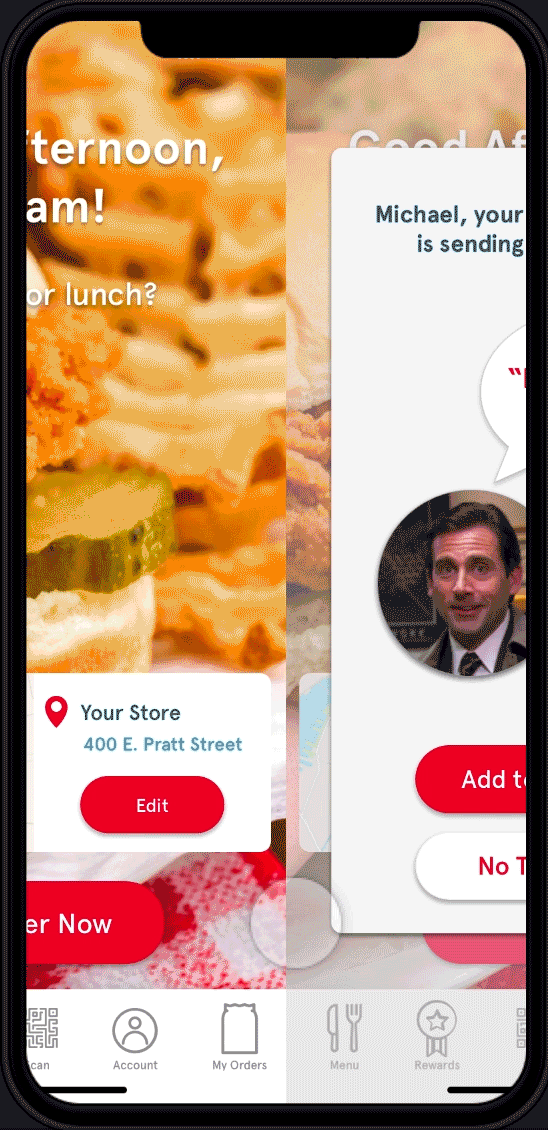
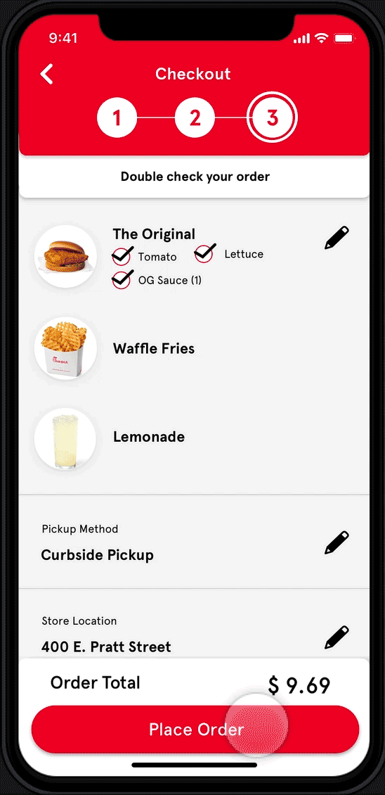
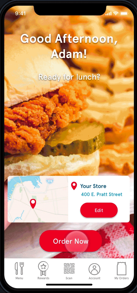
On the right, we see the user opening the app, being offered a free soda from the store manager, ordering an OG Chicken Sandwich without pickle and with lettuce and tomato, and adding waffle fries and a lemonade to make it a meal. The user chooses curbside pickup ASAP, and then places the order
-
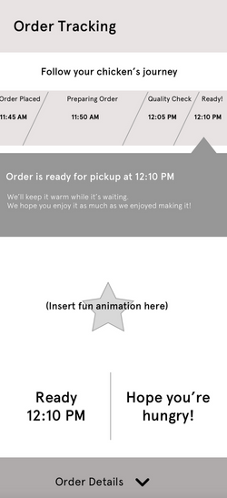
On the left, we see a sped up version of the order tracking process: order placed, preparing order, quality check, and ready. We also see the curbside pickup instructions, which were inquired about by one user during the test of the first iteration.
User Testing, Round 2: "But I Didn't Want Soda."
We ran three user tests, two in person and one over Zoom, giving the users a scenario and a series of tasks and questions relating to it.
What we heard from users:
-
"I like to do many things on the same screen."
-
"I didn’t want soda. I wanted lemonade!"
-
“Maybe if I added something to my cart and then I got a message that hey, the specific thing you wanted is on us.”
-
"I’d be driving, so I wouldn’t even see this.”
-
"I have no idea what this means."
-
"The picture of the entrance to the garage is a nice touch."
-
“If I was an intern whose job it is to pick up Chick-fil-A for the team, I’d download this app.”
-
"The quality check...is it really necessary?"
-
“I hope there is a chicken sammich at the end of this test.”
Hits
-
The ordering flow: the improved menu categories and the workflow of customization were intuitive.
-
Pickup instructions: our testers all agreed that it a nice touch.
Misses
-
Rewards pop-up: Rewards are better when they’re directly relevant to the user.
-
Order tracking is still lacking. Can we turn the “ready” phase into a celebration?
Final Iteration

The most meaningful change in the final iteration was moving the rewards to the end of the experience. Chick-fil-A's app often has pop-up rewards that show up as soon as the user opens the app. We knew from our discovery phase that users love surprise rewards, and after seeing the way users reacted to this pop up in testing, we decided to move it to the end of experience and to apply it to an item that's already in the user's cart. We added a relevant surprise reward right before the check out.
We also made order tracking vertically oriented instead of horizontally, and added fireworks right when the order is ready as the celebratory element that wraps up the digital experience.
Here is a GIF of the final prototype:
Final Thoughts
During the discovery phase, when it became apparent that for some users eating at Chick-fil-A is a deeply satisfying, pleasurable, even ritualistic experience, I asked myself and my team: Can / should the digital experience mirror this IRL experience? And if so, how?
We know that social media apps tap deep into our psychology. What about food ordering apps? Can Chick-fil-A's app mimic or invoke its famously chipper employees, authentically? And should it? After all, the goal in UX is often to minimize friction. But real life is full of friction. So here I am thinking of ways to add friction back in.
If I could re-do this project from scratch, I would spend a lot more time on this question.